I’ve been playing around with AI tools a lot lately, but what happened the other day genuinely stopped me in my tracks. I fed ChatGPT one of the most detailed, picky prompts I’ve ever written for an infographic about Elon Musk, and the result? I literally said out loud, “I have never seen anything like this.”
The prompt was this:
“Create a visually rich infographic about Elon Musk. Start by researching his life, major achievements, career milestones, philosophy, and unique impact on technology and design. Present information through annotated visuals and structured callouts, not generic sections. Style it like a bold graphic illustration: a detailed, photorealistic central portrait as the focal point, supported by timelines, diagrams, product references, quotes, and concise text elements. Use clean backgrounds and a mix of photorealism with strong graphic elements (shapes, icons, color blocking) in a layered composition. Make it dense, tactile, and professionally authored.”
I got this output:
I expected something decent – maybe a cool layout with some AI quirks. What I got was something that looked like a top-tier graphic designer and researcher had spent days on it.
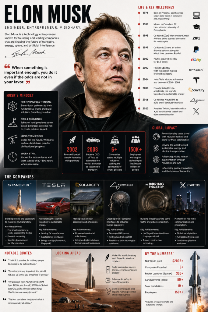
The central portrait of Elon was photorealistic and incredibly lifelike. Around it, everything was perfectly arranged: a timeline showing his journey from Zip2 and PayPal to Tesla, SpaceX, Neuralink, and xAI.
There were annotated diagrams of a Starship rocket, the Cybertruck silhouette, solar panels, and even a simplified Neuralink brain interface. Quotes like “First principles thinking” and “Make life multiplanetary” were rendered in beautiful, crisp typography that actually fit the design instead of looking slapped on.
What blew me away most was the text rendering. Every single callout, label, and annotation was perfectly legible, spelled correctly, and integrated seamlessly into the composition.
No weird letter distortions, no hallucinations in the facts – it was dense with real information but felt clean and professional.
The mix of photorealism with bold graphic elements, color blocking, and icons made it feel tactile and premium, like something you’d see in a high-end magazine or a professional presentation deck.
It also amazes me that you prompt it to use a tool logo in its image, which is something that is always a problem for specific users.
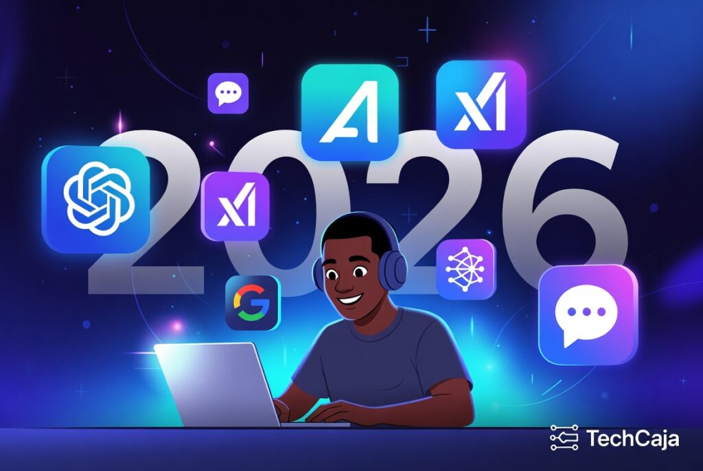
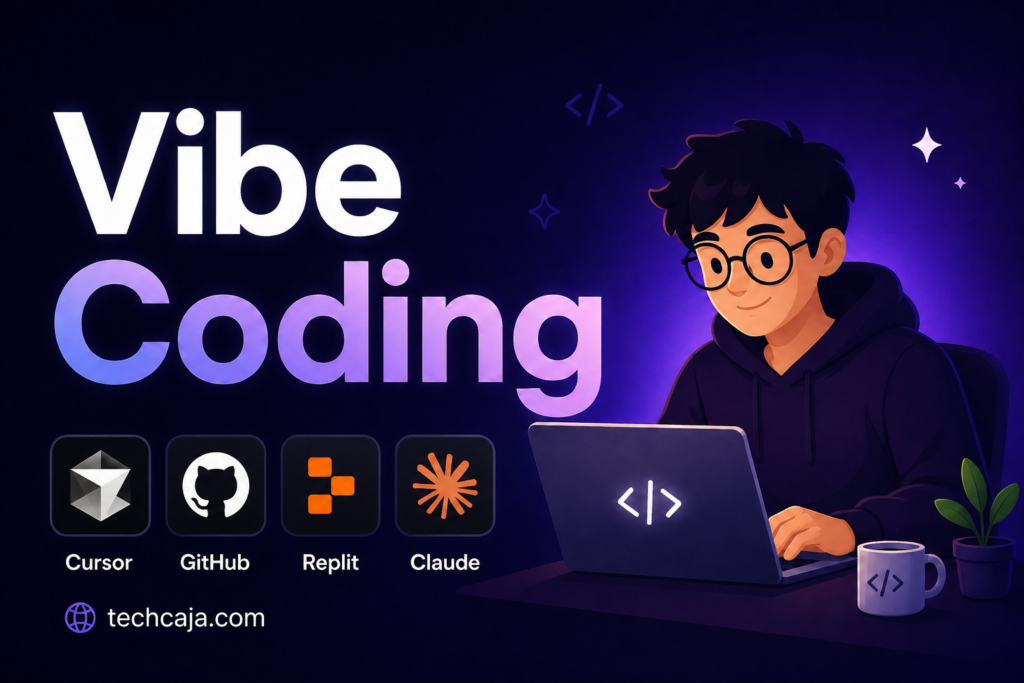
The image below was generated with this prompt:
“Create a blog thumbnail with the text “Vibe Coding.” Add this vibe coding tools icon in the image such as Cursor, GitHub, Replit, Claude.
You can add an illustration character too. But simplicity and quality is all I want. Add TechCaja.com as the image credit”
I’ve used other AI image tools before, and they often stumble on complex layouts or text-heavy designs. This felt different – like ChatGPT truly understood the vision and executed it at a level I didn’t think was possible yet.
This experience has me excited (and a little scared) about where visual content creation is heading. As someone who’s not a designer by trade, being able to describe something this specific and get results this polished is game-changing.
Has anyone else had a moment like this with AI visuals lately? Drop your experiences in the comments! I’d love to hear what prompts have blown your mind.